By Paul Yeager, author of Literally, the Best Language Book Ever
Sarcasm is misinterpreted often enough when spoken, so imagine how often it’s misinterpreted through writing. That’s why the clever people at sartalics.com have started a petition to bring a sarcasm font to the Internet.

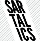
Sartalics logo (courtesy Sartalics.com)
The font is a reverse lean–like a left-leaning italics.
It’s an interesting idea, especially for those obsessed with social media sites such as Twitter, but I think it’s going to be a long time before it reaches the masses.


